Stung to the quick by recent criticism of my choice of pictures, I decided to get a "sense of the house". Please take a look at the pictures below and use the comments to cast your vote(s) for which one we should use in tomorrow's (Sunday's) links. None of these will be used, but I want to get a general feeling for preferences and why. We appreciate your cooperation in this arduous task.
A.

B.
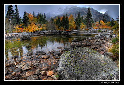
C.

D.

E.
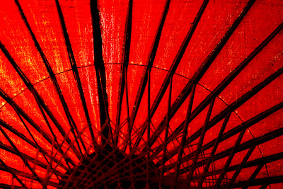
F.

G.


11 comments:
Stacked deck? F. "Portrait" works better (formatting more pleasing to the eye) than "landscape" in hourly, daily, weekly links-type posts in my opinion and after all that's what it's really all about—the useful links.
Proof? Look at the two posts with picture of clocks. There's no comparison.
A.
E is too photo stock catalogish. G is interesting, though. Actually, I pretty much like all the ones you have used to date, MHA.
I trust your taste. Twarn't I what was complainin'.
If I must vote, mine is A, F, C, B in that order of preference. The rest you can keep.
Well, the consensus seems to be keep the grllzzz so we're keeping the grllzzz. Knucklehead, my preferences are exactly along the same lines as yours.
Hehehe... I'm amazed that I got away with stirring up this foolishness without anybody pointing out that my posts are illustrated by drunken apes, monsters from 1950 movies, and numerous Turkmenbashi portraits.
Ambi,
I love your posts. You can put in anything you like for pictures and it will be fine.
C and F.
A,F, and B.
I like your blog!
Post a Comment