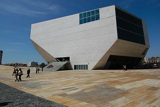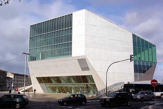
Koolhaas' Casa da Musica in Porto.
A year ago this January there was a discussion of modern architecture over at Roger's place kicked off by Roger's visit to the Seattle Library. Some of us, *cough*, felt that Rem Koolhaas had created an unlivable monstrosity and scammed Seattle for millions of dollars for the privilege of doing so. Well, guess where Koolhaas lives?
SPIEGEL: Some people say that if architects had to live in their own buildings, cities would be more attractive today.
Koolhaas: Oh, come on now, that's really trivial.
SPIEGEL: Where do you live?
Koolhaas: That's unimportant. It's less a question of architecture than of finances.
SPIEGEL: You're avoiding the question. Where do you live?
Koolhaas: OK, I live in a Victorian apartment building in London.
 So there you have it. At least the man knows what works, he just chooses to torture the rest of us for his own perverse pleasure. More here. I admit that I chose the ugliest photo for illustration. For I am a professional. Here is a view of lesser ugliness.
HT eta-ta.
7 comments:
Let's all go back to thatched huts!
Actually, IMNSHO, many of these 'monstrosities' wouldn't look/feel/seem/be so bad if they were among a variety of similar type 'monstrosities'.
They're jolting otherwise.
The phrases to remember are:
Form follows function
and
Variety in Unity.
Without closer study I don't know if the first is adhered to, but the second surely is not.
Of course having an entire city of them probably wouldn't be so hot either.
Actually, these things ARE ugly. They look like laser printers.
I disagree. It looks like a laser printer that was dropped and landed upside down. A subtle but poignant difference.
I find that my thoughts haven't changed since I first saw pictures of this thing. There are some really, really dumb people in Seattle who have far more responsibility than the evidence of their judgement would deem justifiable.
Knuck,
I've always thought the Guggenheim was brilliant--a perfect way to view art. Granted, it doesn't fit with its surroundings, but that's not always paramount. We expect art museums to be a piece of art themselves, and it is one.
Well, in my experience, from back in the days when I read books in libraries, it was always much harder to concentrate (on books) in the beautiful buildings, say the Gothic chapel library, than in the modernist monstrosities where there was nothing to look at.
On my brief visit to the Seattle library, I appreciated the book spiral for this reason (kind of like being in a submarine, i imagined) though i noticed the collection was rather impoverished compared to the pretensions of the building.
I would say at least half the patrons of that library thought it a good place to plug into the internet. The place is wired for the laptop demographic, and while there were many empty reference terminals, most library patrons seemed to be jammed into the room for machines connected to the net. It's kind of funny, but oh so human when you think about it, that we are still building grand centralized buildings to serve a desire to keep one foot in the old urbanity while connecting to the most decentralized medium of all.
Isn't that where Luke bought the droids?
Knuck, you're talking about the New York Guggenheim? The Frank Llyod Wright one? The one that makes the whole exhibit one continuous stroll, instead of breaking it up artificially into arbitrary little exhibits?
Bite your toungue, man!
(Not to mention the worlds' best indoor sledding hill.)
Post a Comment