The fundamental problem with the Gini is that there is no a priori way to determine what the "ideal" number is. Zero is the theoretical minimum, which would mean that everyone (or every household) had exactly the same income, but I suspect that most thinking people would toss that out immediately as not being a reasonable goal. Such a system has been attempted (at least nominally in the form of Communism), and it failed miserably. On the other hand, the coefficient could be as high as 1.0, meaning that all income is earned by a single household, with all other households earning nothing. That, also, is easy to reject as an ideal.
So what is the ideal? Well, obviously, somewhere between 0.0 and 1.0. Not very informative, I suppose, but it seems to me that's part of the problem with the Gini. The Gini coefficient is not meaningful in itself; it is, rather, an artifact of an economic system that either works well or doesn't. If the system is working well (making people richer), I would say that's a pretty good system, regardless of the Gini that falls out. If not, I'd say that's probably not a good system, and again the Gini has nothing to do with it.
Hence, the use of the Gini as a bludgeon against the US economic system is strictly political, and is, I think, based on the implicit, unjustified (and as we'll see, probably unjustifiable) assertion that the increasing Gini means the rich are getting richer and the poor are getting poorer (at the very least it relies on an appeal to the Gini being "too high").
The common response to claims that the increase in the Gini is a bad thing is along the lines of "so what if Bill Gates's income increased faster than mine did, mine increased, too. Why should I be jealous?" That's a reasonable response, and in line with my thinking - if the system is making everyone richer, why should we care that there are more really rich people, or richer really rich people, relative to the bulk of us? But it's anecdotal - your income increased, but it's possible that the bulk of the distribution of incomes fell back towards zero and only the part incorporating the wealthy got wealthier. Maybe you're just one of the lucky rabble who got bounced up a bit while those around you generally moved down.
So let's look at the relative distribution of household incomes in 1989 and 1999, adjusted to reflect changes in purchasing power, and see if that provides any insight into how incomes have changed over time.
The US Census publishes household-level income data with every national census - the data available online reflect incomes in 1989 and 1999. Because the cutoffs that are used to group incomes vary from one census to the next, and because the purchasing power of dollar fell (due to inflation) over that time, direct comparison of the two censuses is difficult. Therefore, I've fit the data for each year with a 2-parameter Weibull distribution [technical note: The fits were performed using maximum likelihood fits to the cumulative observed distribution], allowing me to compare the parameters of the fitted distributions instead of the chunked data.
I suppose some sort of theoretical case might be made for the use of the Weibull, but I chose it because a) it fits the data reasonably well (at least for incomes up to about $150,000), and b) its two parameters, the shape parameter and the scale parameter, get directly at the issue at hand. Changes in the shape parameter reflect changes in the way income is distributed across households - the rich getting richer faster than the poor, for example. Changes in the scale parameter, on the other hand, reflect increases (or decreases) in household income that have been equally shared by all households - that is, if everyone got richer by 10%, the scale parameter should increase by 10%.
There is also a practical advantage to this - the adjustment for inflation becomes much easier. I can fit to the original data, and simply adjust the scale parameter by an amount equivalent to the change in the purchasing power of a dollar over the decade.
I've overlaid the best-fitting 2-parameter Weibulls onto the observed income distributions for 1989:

and 1999:
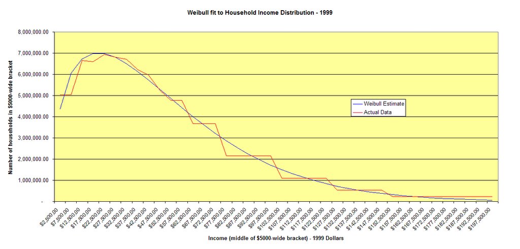
As you can see, the fits are pretty good. They're not perfect - the discrepancies are statistically significant by any standard, but since we're only interested in whether the general shape of the distribution changed that doesn't bother me. The fits are quite good over the ranges up to $150,000 or so, beyond that the Weibull greatly underestimates the number of households (i.e. there are more people with very high incomes than would be the case if household incomes were truly Weibull distributed). This is not an indictment. It doesn't mean there are "too many" people earning a lot of money. What it does mean is that the Weibull is going to be more useful for comparing the big lumpy part of the distribution across the decade than it will be for comparing the long tails.
Here are the results. The shape of the best fitting distributions is exactly the same. I'm using "exactly" only very slightly inexactly - the shape parameters differ (1.3458 in 1989 versus 1.3464 in 1999), but the difference is so small that the curves appear to lie on top of one another. I'd put up another graph, but just trust me - holding the scale parameter constant, the two shapes are so similar you can only see one line.
On the other hand, the scale parameter increased from 1989 to 1999, with the result that the two distributions (normalized to the same income scale and expressed in 1999 dollars) look like this:
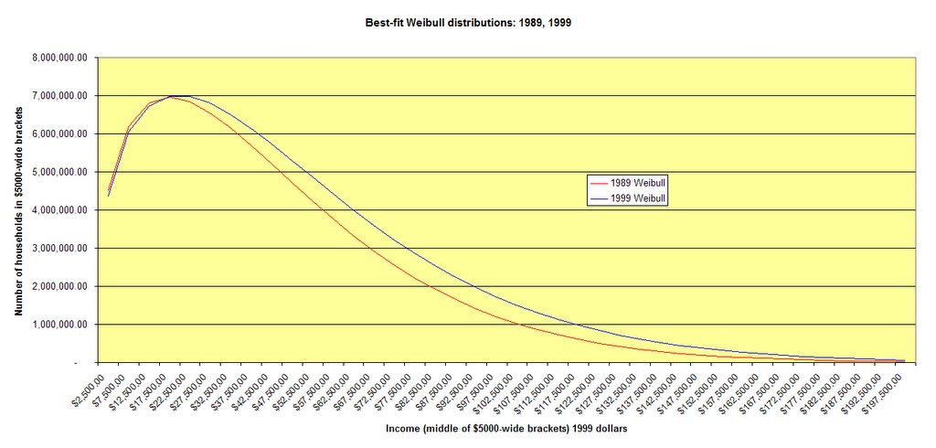
What's different? Well, there are more households reflected in 1999 (105 million versus 92 million), and the scale parameter has increased by 13% - estimated mean household income went from $47,784 to $53,961. The result is that there are actually fewer households in the lowest economic brackets (those with household incomes below $17,500) in 1999 than in 1989, despite the number of households having increased by 15%.
On the other hand, there are many more households earning more than that. Here I've just subtracted the number of people estimated to be in each income bracket in 1989 from those in that bracket in 1999, providing a rough idea of the incomes of households "added" to the group during those years:
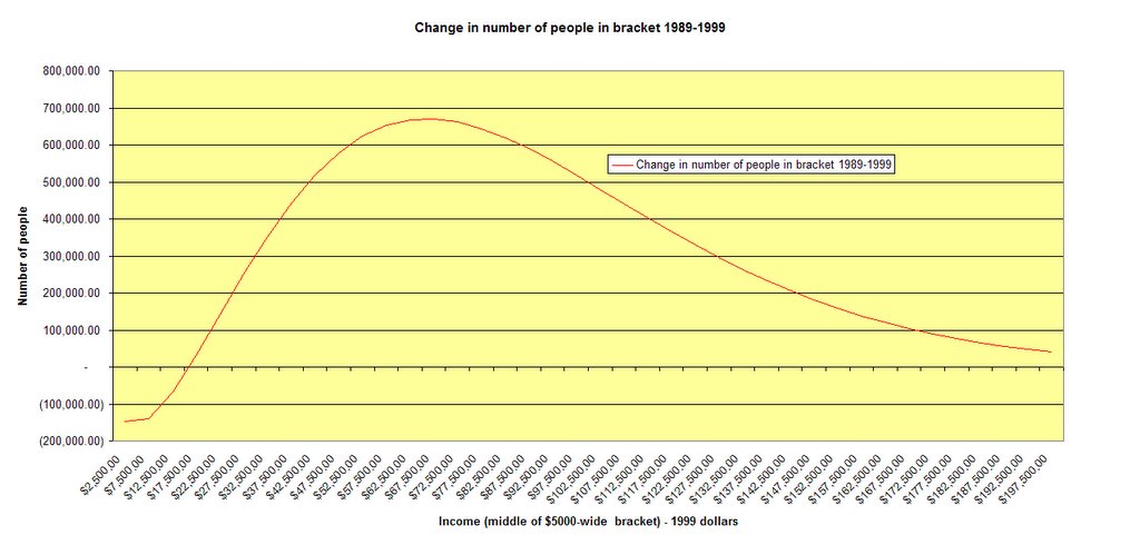
The peak occurs between about $40,000 and $100,000, an interesting tidbit if you've been hearing, over and over again, that the middle class is disappearing.
The upshot is this - it looks like the usual defense against the Gini brickbat is dead on. Inequality may have increased (though if it did, that must have occurred out in the right-hand tail of the distribution - the identical shapes found for the "lower" income strata (up to $150,000) imply identical Gini coefficients over that range), but the lumpen masses became quite a bit better off as well.
[Two caveats apply. First, remember that 1999 was at the tail end of an economic boom, and that may have exaggerated the differences between the two times. Second, remember that the fitted curves are estimates, not actual data. I will vouch for there being no obvious contradictions between the above analysis based on the estimates and the original data, but the original data are difficult to compare directly, which was why I fitted curves to them in the first place.]
4 comments:
I know it is capitalism but I think the huge sums of money made by some high profile people have a lot to do with the perception that the rich are getting richer and the poor are getting poorer.
Athletes, movie stars, entertainers, etc make such ridiculous money that it kind of takes away from the idea that performing a useful function has anything to do with reward.
That simply exacerbates the perception of inequality and unfairness. Add in the trust funders like Paris Hilton and you have a class of wealth that is no more related to work than Marie Antoinette or the Czarina.
Right or wrong, people who have to work for a living resent that.
david:
That is because macaroni and cheese is cheap.
fresh air:
I think the Gini is innocent of increasing for the reason you describe - if everyone's income increases by 10%, it should stay the same. I can't think of any particular reason to think that everyone's income should increase by the same amount, though. As you said, people in the lower brackets tend to be engaged in qualitatively different pursuits than those in the upper brcakets.
There is also the fact that some chunk of the upper brackets represents people who just sold a business, and therefore have a great deal more income (for a year or a few years) than they had previously. I haven't done anything to see what impact that would really have, but liquidation of businesses as the owners retire are expected to amount to something like $4 trillion over the next eight years.
Terrye:
I agree that the reporting of the high earnings of high profile people tends to make others feel shortchanged, and I also agree that the occupations of these people often conflict with some long-founded notions of what makes work valuable.
David and Terrye:
It's true that, in general, boats are rising, but even in a rising tide some boats sink. It's also true that many people "feel" poor despite having enough to eat, owning cars, and living in homes with plumbing and climate control. It's also true that some people don't have all these things but struggle mightily to make ends meet.
Often these are young people with better days ahead. Other times they are victims of poor choices.
And still other times they are victims of bad luck or poor health. That's the impulse behind social welfare programs - no one wants those people to starve.
Morgan,
My compliments. Another piece worthy of a wider audience.
Knuck,
I agree with FA concerning pols unwillingness to define "poor". Your reading of the situation is spot on concerning using static analysis on "the pie". It's a Marxist technique that's been in use for 150 years and it's just clever enough to fool the dummies in the press.
Post a Comment