Showing posts with label advertising. Show all posts

Wednesday, November 02, 2022

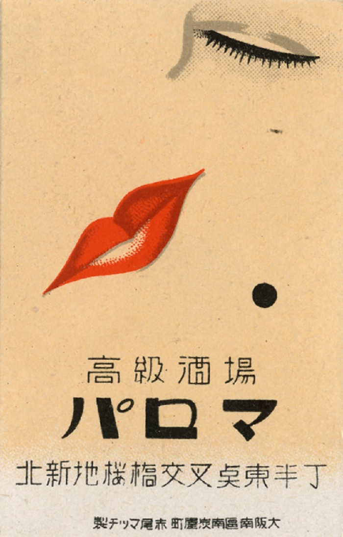
Old Japanese matchbooks

Click any image to enlarge

It used to be that most public establishments would have ashtrays with matchbooks laid next to them. The matchbooks would have advertisements on them, for either the business itself or some other service. Of course, since the matchbooks were small, the ads were tiny as well. As a result, the graphics and ad copy were minimal.

With the decline of public smoking promotional matchbooks have faded into the past. These images, and those after the jump, are of some old Japanese matchbook covers. There are more at the Flikr stream Japanese matchbox labels.

Saturday, January 08, 2022

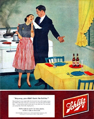
Old beer ads

Click any image to enlarge

There is a genre of clickbait that teases old ads that would never be acceptable today. The above ad is often featured, because any mention of a female in a domestic setting is a sin against nature to a certain segment of modern damsels (btw, a bit of useless trivia -- damsel comes from the French word damoiselle and the male equivalent is damoiseau, so I guess us guys would be a damseau?). 

I just took the ad to be a joke. Curiously enough, when I was dating Mrs. Sinistral the first time she invited me to her apartment she burned steak she was cooking and got upset like the woman in the ad. However, to console her over the charred steak I didn't counter that the beer was OK -- and I doubt that would have worked. Besides, and how can I say this delicately... the steak was not my priority that night anyway, so I cleverly employed different tactics. 

Below, and after the jump, are more old beer ads. Since guys are generally buying the beer they feature a lot of pretty women and/or convivial settings. Enjoy.


Wednesday, May 26, 2021

Shaving cream and after shave

Click any image to enlarge

These print ads for shaving creams and after shave products are from the early to mid 20th century. Since they are from newspapers or cheap magazines, most of them are not full color. The two color ads are usually with black and red inks, since the red ink captures attention and can be toned down and mixed with grey to be flesh colored. The Barbasol ads in particular use that trick. The primary sales hooks were sex appeal and making shaving more comfortable. 

These images, and those after the jump, are from the Duke University's digital archives. There are more at the link.


Wednesday, March 17, 2021

Queen City Ink

Click any image to enlarge

These are a series of advertisements made for the Queen City Printing Ink Company at the beginning of the 20th Century. They were done to highlight the companies ink colors and type faces. Their simple and bold design is the work of Augustus L. Jansson who, along with creating ads, was a cartoonist and greeting card designer. 

His striking and simple style isn't quite yet Art Deco, but it certainly anticipates it. Many of these images are from his Ink Beasts Parade series of ads.

These works, and those after the jump, are from the Public Domain Review's Augustus Jansson’s Queen City Ink Adverts (1903–1907). There are more at the link.  

Augustus L. Jansson

Wednesday, January 27, 2021

Beauty is youth at all ages

Click any image to enlarge

These are graphics from Palmolive soap ads from the 1920s through the 1950s. Palmolive's ad agency used several templates for the ad layouts, with one of the most common being a strong graphical image at top with teaser text (the rather incoherent phrase that acts as the title of this post is one of the teasers). The image to the left shows the full ad that the above image is taken from.

The Palmolive ads are aimed at women, and they stress youth, beauty and romance. Occasionally the interests of the day surface -- during the war years the men appear in uniform, there is a spate of ads featuring the Dionne quintuplets, while early ads featured an Egyptian motif that was probably a result of the finding of Tut's tomb and the burst of interest in Egyptology at the time.

By contrast today's soap ads are much more fixated on natural ingredients, moisturizing, scents and skin care. I wonder what the future holds? 
 
These ad images, and those after the jump, were taken from the Duke University Archive's Palmolive Company collection. There are more examples at the link.

Thursday, December 05, 2019

Greyhound Bus ads

Click any image to enlarge
These are color advertisements for Greyhound Bus from the mid 1940s to the mid 1950s. The early ads focus on soldiers returning home and later they focus on travelling to see different parts of America.

In his Civil War: a Narrative Shelby Foote talked about the long campaigns meant that the primarily rural soldiers traveled far and developed a different sense of the nation. Similarly, in WWII many of the young men had traveled to Europe, Africa or Asia. In the years after, and before the wide spread of the car culture or cheap airfare, these young men and their families wanted to see distant places in the States. Greyhound buses provided them with a means to travel long distances.

These ads, and those after the jump, are from the Ad Access section of Duke University's digital repository. 


Saturday, June 16, 2018

Ads for alcohol

Click any image to enlarge
Here is a small collection of old beer, wine and liquor ads. I love the delighted expression on the guy's face in the ad above. The pure malt tonic below was an advertising strategy of the early 20th century. Sometimes, as well as advising the tonics to mothers, it was also suggested to let the little ankle-biters have a nip as well. You can read about that at Just What the Doctor Ordered.

There are a few more ads after the jump. Enjoy.


Tuesday, April 04, 2017

Horseless Farming With Ford Tractors - 1917 Film


Little Billy Todd leaves the farm and discovers Ford tractors and true love. The Ford tractor plant seems to be from before assembly lines. And the tractor sure spews a lot of smoke.
 

Monday, January 16, 2017

The National Joy Smoke

Morgan, in the comments to the previous post, pointed me towards Language Log's post "Just let some joy smoke sift into your system". It is a 1919 ad for Prince Albert tobacco, and the ad copy is absolutely hilarious, featuring such gems as " two-fisted-man-tobacco", "breezing up the pike with your smokethrottle wide open" and "put pep-in-your-smokemotor".

There are several other old Prince Albert ads at the link, and they are equally as entertaining.

The blog itself is a language-centric blog, with a lot of discussion of Chinese, and a lot of entertaining articles on other topics as well. I'll be adding it to our blog roll.


Thursday, May 29, 2014

What every man and girl should know


Here is a small collection of vintage coffee ads. Not surprisingly, they mainly show smiling people holding a cup of coffee, but there are variations to the theme. Also, they tend to emphasis the aroma over the taste. There are a few more samples after the jump.

Click any image to enlarge

Tuesday, November 20, 2012

Men Who Plan Beyond Tomorrow

We're only missing the usher's uniform
(click any image to enlarge)
In the 1940s, long before Dos Equis' The Most Interesting Man in the World, Seagrams ran an advertising series around Men Who Plan Beyond Tomorrow. Instead of looking backwards the ads looked towards the future. While many of their futures, the wonders of atomic farming for example, were wrong in an amusingly goofy sort of a way, many of their guesses were pretty good.

From the Flickr stream MWPBT! where there are more examples from the ad campaign.

Are those pajamas he's wearing?
The inverse of what a convenience store became
They only missed the number of different channels
Not exactly how pizzas came to be delivered

Sunday, September 09, 2012

Tsarist era Russian adverisements

Click any image to enlarge
The vintage ads and magazine covers I post stylistically tend to break along the boundary of the 19th and 20th centuries. The newer stuff -- up until photography starts replacing artwork -- tends to be in a crisper, early modern style. The older vintage art, like this set, often is overly sentimental and has many more decorative flourishes.

I find it interesting that modern graphic artists mine the mid-20th century for inspiration, but avoid this earlier style. I suspect part of it is the decorative flourishes, which are hard to do, but much more is that they avoid the underlying narrative style that pops out of much of this earlier work.

I'm not sure why they would do that. Perhaps the narrative power of video has concealed from them the fact that static graphics can also carry a narrative if put together properly. In an earlier post of mine, The empty heart of political correctness, I touched upon the same idea by comparing a modern painting about children and race to Normal Rockwell's much better treatment of the same subject.

These advertisements are from the EnglishRussia post Tsarist Russian Ads. There are more samples after the jump, and even more at the EnglishRussia link.


Wednesday, June 20, 2012

When men were men

Click any image to enlarge
Old shirt ads from the Vintage Everyday post The 10 Sexiest Shirt Ads From The 1970s. I implore my female readers to try to control themselves while viewing them. If you must, the other 7 ads are at the link. 


Saturday, February 11, 2012

Cigarette cards

Click any image to enlarge
Cigarette cards were once common inserts that came with packages of cigarettes. As explained at the introduction page of the CigaretteCards website:
In America during the 1880's cards known as 'stiffeners' were inserted into paper packets of cigarettes to reinforce the packaging and so to protect the contents, someone (believed to be an American journalist) had the idea of advertising by printing a picture and descriptive details on them. An early set of cards issued by Taddy & Co. titled Clowns and Circus Artistes is one of the most expensive sets, valued at £650.........per card!! Now you know why the Clown, which is one of the cards in this rare set of 20 is at the top of this page. Although cards packed for the British market were marketed by 1885, it took some 2 years later for a British manufacturer to issue a card.

W.D.& H.O.Wills were the pioneers in advertising and promoting their product and towards the end of the 1880's issued small tickets with wording on (which I hope to include soon), followed by illustrations of some packings and miniature copies of famous showcards. Their debut is believed to be around 1887.
The cigarette card samples illustrating this post are from an extraordinary collection maintained at cigardpix's photostream. It contains several thousand examples of the card sets, broken down by categories. One of my favorite categories was 'Boy Scouts and Girl Guides'. Can you imagine what a ruckus cards like that in cigarette packages would cause today?

Cigarettepix has kindly given me permission to post some of the cards. Faced with such a wealth of choices, I limited myself to cards from the 'Around the World' category. There are more after the jump, and literally thousands more at cigardpix's photostream.

I do hope to revisit the stream in the future with more posts. They're nice graphics, and the range of topics they cover is surprising. By the way, should you decide to take up cigarette card collecting, the hobby is called cartophily and the CigaretteCards website has more information about it.